All About Data Visualization Using Seaborn
Data Visualization for Data Science-
What and Why?

Data visualization is the act of
taking statistics and positioning it into visual factors such as a map or
graph. Data visualizations make sizable and minute data easier for the human
brain to comprehend and visualization also makes it elementary to perceive
patterns, trends, and outliers in categories of data.
Data Visualization is important
because visually represented numbers are more appealing when presented to
business owners or stakeholders. According to Tableau, “[data visualization is]
one of the most useful professional skills to develop. The better you can
convey your points visually, the better you can leverage that information.”
Data Visualization Packages
It basically has 3 packages:-
- Matploltlib- This is the most basic package which is used to plot simple and standard graphs like bar, pie, etc. Here plotting is fast
- Seaborn- This is a package built on top of matplotlib and supports many complex graphs like box plot, pair plot, etc
- Plotly- This is an advanced package which helps us get some cool features related to graphs
This article covers visualizations using the seaborn library
majorly used in the Data Science field.
Import the Libraries
The first step to work on data visualization with seaborn is to
import the correct packages for it along with the NumPy and Pandas libraries.
See the picture below.

What kind of Graphs can be created
using Seaborn?
For Univariate Distributions following graphs can be used:-
- Distplot- The most easy way to look at univariate distribution is by plotting a distplot. By default, it gives a histogram and fits a kernel density estimate. One can add or remove KDE and can even add a rug plot that draws a vertical tick at each observation.

- Distplot with KDE

- Distplot with Rug


For Bivariate Distributions following graphs can be used:-
- Jointplot using Scatter- The most familiar way to look at a bivariate distribution is by plotting a scatter plot. Jointplot allows us to match up to two distplots. It shows the relationship between two variables. Here your kind can be any plot.

- Jointplot using Hex-

- Jointplot using KDE


- Jointplot using Regression

For Pairwise Bivariate Distributions following
graphs can be used:-
- Pairplot- This graph will plot pairwise relationships across an entire dataframe. by default, it also draws the univariate distribution of each variable on the diagonal axes.

For Plotting With Categorical Data following graphs can be
used:-
- Stripplot- In a strip plot, the scatterplot points will usually overlap. This makes it difficult to see the full distribution of data. One easy solution is to adjust the positions (only along the categorical axis) using some random “jitter".

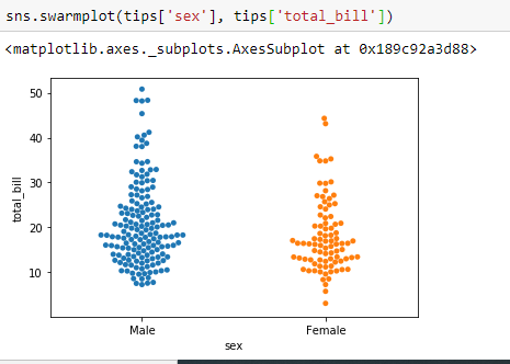
- Swarmplot- A different approach would be to use the function swarm plot(), which positions each scatterplot point on the categorical axis with an algorithm that avoids overlapping points.
- Barplot- Barplot is a general plot that allows you to aggregate the categorical data based on some function, by default the mean. Bar plots include 0 in the quantitative axis range, and they are a good choice when 0 is a meaningful value for the quantitative variable, and you want to make comparisons against it.

- Countplot- Countplot is the same as the barplot except the estimator is explicitly counting the number of occurrences. Which is why we only pass the x value.

- Pointplot- An alternative style for visualizing the same information is offered by the pointplot() function. This function also encodes the value of the estimate with height on the other axis, but rather than show a full bar it just plots the point estimate and confidence interval. Additionally, pointplot connects points from the same hue category. This makes it easy to see how the main relationship is changing as a function of a second variable.

- Boxplot and Violin Plot- These are used to show the distribution of categorical data. A box plot (or box-and-whisker plot) shows the distribution of quantitative data in a way that facilitates comparisons between variables or across levels of a categorical variable.

- Factor Plot- These are used for multi-panel categorical plots. Various types of kind inputs can be given like point, bar, count, box, violin or strip.

- Regression Plot- The regression plots in seaborn are primarily intended to add a visual guide that helps to emphasize patterns in a dataset during exploratory data analyses. Regression plots as the name suggests create a regression line between 2 parameters and helps to visualize their linear relationships.

Summary!
In this article, we learned about different types of
visualizations that can be prepared by the seaborn library. A lot more is there
to be explored but these are the basic and the most often plots that are used
in the field of Data Science.


Good information you shared. keep posting.
ReplyDeletedata science courses
Nice article. I liked very much. All the information given by you are really helpful for my research. keep on posting your views.
ReplyDeletedata analytics courses delhi
"Very Nice Blog!!!
ReplyDeletePlease have a look about "
best data science course in delhi